Color of Cappuccino: A Guide to Its Shades and Variations
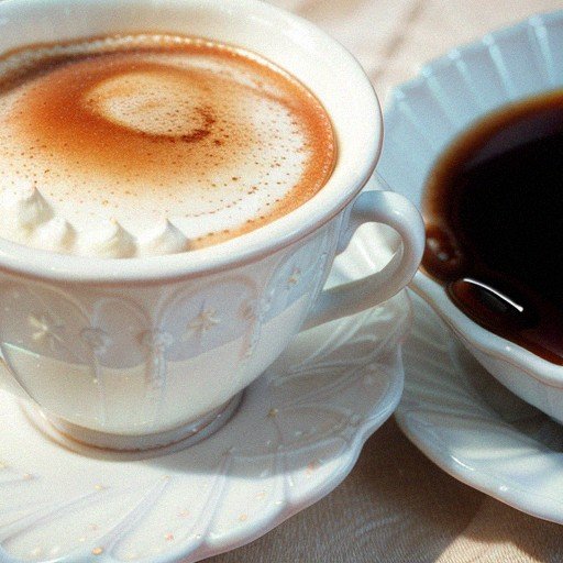
Cappuccino is a popular coffee drink that originated in Italy. It consists of espresso and steamed milk, topped with foamed milk. However, cappuccino is not just a beverage; it has also become a popular color in fashion, furniture, and interior design.
The color cappuccino is typically a light to medium shade of brown, with hints of gray, tan, and off-white. It is often described as a muted shade of brown, similar to the color of coffee with a little bit of cream or milk added. The hex code for cappuccino is #C5AB9F, which is composed of 37% red, 32% green, and 30% blue.
Key Takeaways
- Cappuccino is not just a coffee drink; it has also become a popular color in fashion, furniture, and interior design.
- The color cappuccino is a warm, inviting shade of brown with hints of gray, tan, and off-white.
- The hex code for cappuccino is #C5AB9F, which is composed of 37% red, 32% green, and 30% blue.
Understanding Cappuccino
Cappuccino is a popular coffee drink that has its roots in Italy. It is made with espresso, steamed milk, and milk foam. The drink is typically served in a small cup and is often enjoyed as a morning or mid-day pick-me-up.
The color of cappuccino is typically a light to medium shade of brown, with hints of gray, tan and off-white. It is often referred to as a muted shade of brown, similar to the color of coffee with a little bit of cream or milk added. The color of cappuccino can vary depending on the ratio of espresso to steamed milk and foam.
In Italy, cappuccino is traditionally consumed only in the morning and never after a meal. It is considered a breakfast beverage and is often paired with a pastry or biscotti. In other parts of the world, cappuccino is consumed at any time of the day and is often paired with a light snack or enjoyed on its own.
When making cappuccino, it is important to use high-quality espresso and properly steam the milk to achieve the desired texture and flavor. The milk foam is a crucial component of cappuccino and is what gives the drink its signature light color.
Overall, cappuccino is a delicious and popular coffee drink that is enjoyed by people all over the world. Whether you’re a coffee connoisseur or just looking for a tasty pick-me-up, cappuccino is a great choice.
The Color of Cappuccino
Cappuccino is a warm, inviting color that is often used in home decor and fashion. It is typically a light to medium shade of brown, with hints of gray, tan, and off-white. It is often referred to as a muted shade of brown, similar to the color of coffee with a little bit of cream or milk added.
Cappuccino color is a creamy beige that conjures the decadent swirl of milk in a cup of coffee. It is a shade of brown that is versatile and can be used in a variety of settings. It is a popular choice for interior design, as it creates a cozy and welcoming atmosphere. It is also a popular color for fashion, as it is neutral and can be paired with a variety of other colors.
The shade of brown that cappuccino color represents is a warm and comforting color that is associated with stability, security, and reliability. It is a color that can evoke feelings of relaxation and calmness, making it a popular choice for bedrooms and living rooms.
In terms of shades, cappuccino color can range from a light beige to a dark brown. It is a versatile color that can be used in a variety of ways, from accent walls to furniture pieces. It is also a popular color for clothing, as it is a neutral color that can be paired with a variety of other colors.
Overall, cappuccino color is a warm and inviting shade of brown that is versatile and can be used in a variety of settings. It is a popular choice for interior design and fashion, and is a color that can evoke feelings of relaxation and calmness.
Cappuccino in Fashion and Furniture
Cappuccino is a versatile color that has found its way into both fashion and furniture. This neutral shade is a combination of warm hues, such as brown, beige, and tan, making it an excellent choice for a variety of applications.
In fashion, cappuccino has become a popular color choice for both men and women’s wardrobes. This color is often associated with sophistication and elegance, making it a great choice for formal wear. Cappuccino-colored clothing can be paired with a variety of other colors, including black, white, and other neutrals, as well as brighter shades like red and blue.
When it comes to furniture, cappuccino has become a popular choice for both modern and traditional styles. This color is often used in living rooms, bedrooms, and dining rooms, and can be paired with a variety of other colors and materials. Cappuccino-colored furniture is often made from wood, which can range from light to dark shades, depending on the type of wood used.
One of the benefits of cappuccino-colored furniture is its ability to blend seamlessly with other neutrals, such as taupe and gray. This makes it a great choice for creating a cohesive look in a room. Additionally, cappuccino-colored furniture can be paired with bolder colors, such as red or green, to create a more vibrant look.
Overall, cappuccino is a versatile color that can be used in a variety of applications, from fashion to furniture. Its warm, neutral tones make it a great choice for creating a sophisticated and elegant look. Whether you’re looking to update your wardrobe or your home, cappuccino is a color that is sure to make a statement.
Color Combinations with Cappuccino
When it comes to color combinations with cappuccino, there are many options to choose from. Cappuccino is a warm and inviting color that pairs well with a variety of other colors. In this section, we will explore some of the best color combinations that work well with cappuccino.
Cappuccino Color Scheme
One of the most obvious color combinations to use with cappuccino is a cappuccino color scheme. This color scheme typically includes shades of brown, beige, and tan. These colors work well together to create a warm and inviting atmosphere. Some popular cappuccino color scheme combinations include:
- Coconut, Indian Yellow, Bright Gray, and Pale Taupe
- Brown, Beige, Tan, and Cream
- Dark Brown, Light Brown, Beige, and Cream
White Color Palettes
Another great color combination with cappuccino is a white color palette. White is a neutral color that pairs well with almost any other color. When combined with cappuccino, it creates a clean and sophisticated look. Some popular white color palette combinations include:
- Cappuccino, White, and Silver
- Cappuccino, White, and Cream
- Cappuccino, White, and Beige
Silver
Silver is another color that pairs well with cappuccino. When combined, these colors create a modern and sophisticated look. Some popular cappuccino and silver combinations include:
- Cappuccino, Silver, and White
- Cappuccino, Silver, and Gray
- Cappuccino, Silver, and Black
Color of Coffee
Of course, when it comes to color combinations with cappuccino, the color of coffee is an obvious choice. Brown and beige shades are often used in coffee shops to create a warm and inviting atmosphere. Some popular cappuccino and coffee color combinations include:
- Cappuccino, Mocha, and Cream
- Cappuccino, Espresso, and Beige
- Cappuccino, Latte, and Tan
Complementary Colors
Finally, complementary colors can also work well with cappuccino. Complementary colors are colors that are opposite each other on the color wheel. When paired together, they create a bold and eye-catching look. Some popular complementary color combinations with cappuccino include:
- Cappuccino and Blue
- Cappuccino and Green
- Cappuccino and Purple
In conclusion, there are many color combinations that work well with cappuccino. Whether you are looking for a warm and inviting atmosphere or a modern and sophisticated look, there is a color combination that will work for you.
The Science of Cappuccino Color
When it comes to the color of cappuccino, there are a few scientific factors that come into play. Let’s take a closer look at some of these factors and how they contribute to the color of this beloved beverage.
Firstly, the RGB (Red, Green, Blue) color model is often used to represent colors in digital devices such as computer screens and cameras. The RGB values for cappuccino are (197, 171, 159), which means it is composed of 37% red, 32% green, and 30% blue. These values contribute to the overall light to medium shade of brown that we associate with cappuccino.
Another color model that is often used in printing is CMYK (Cyan, Magenta, Yellow, Key/Black). The CMYK values for cappuccino are C:0 M:13 Y:19 K:23. These values represent the amount of each ink color that is used to create the final printed color.
In the HSV/HSB (Hue, Saturation, Value/Brightness) scale, cappuccino has a hue of 19°, 19% saturation, and a brightness value of 77%. These values contribute to the warm, inviting nature of the color and make it a popular choice for home decor and fashion.
Tints are also important when it comes to the color of cappuccino. A tint is created when white is added to a color, which lightens the overall shade. In the case of cappuccino, a small amount of off-white is often added to create the muted, creamy brown color that we associate with this drink.
Lastly, the hexadecimal color code for cappuccino is #C5AB9F. This code is often used in web design and can be used to accurately represent the color of cappuccino on digital platforms.
Overall, the color of cappuccino is a complex mix of various scientific factors. From RGB and CMYK values to tints and hexadecimal codes, there are many elements that contribute to the warm, inviting shade of brown that we love.
Unique Shades of Cappuccino
We all know that cappuccino is a warm and inviting color that is often used in home decor and fashion. But did you know that there are unique shades of cappuccino that can be achieved by mixing different colors together?
One of the most popular shades of cappuccino is a muted shade of brown with hints of gray, tan, and off-white. This shade is often referred to as a “coffee with a little bit of milk or cream added” color. It is warm and inviting and can be used in a variety of settings.
Another unique shade of cappuccino is a reddish-brown tone that is achieved by mixing red and brown together. This shade of cappuccino is perfect for adding a pop of color to any room or outfit.
For those who prefer darker shades, mixing black and dark brown together can create a deep, rich shade of cappuccino. This shade is perfect for adding a touch of sophistication to any space.
Shades of gray can also be added to cappuccino to create a cooler, more muted tone. This shade of cappuccino is perfect for those who prefer a more understated look.
Overall, there are many unique shades of cappuccino that can be achieved by mixing different colors together. Whether you prefer warm, inviting tones or cool, muted shades, there is a cappuccino color that is perfect for you.
Cappuccino Color in Different Cultures
Cappuccino is a timeless and beloved coffee drink that has gained popularity all over the world. While the recipe for cappuccino remains largely the same, the color of cappuccino can vary depending on the culture and region. In this section, we will explore the different shades of cappuccino and what they represent in different cultures.
In Italy, the birthplace of cappuccino, the color of cappuccino is a rich and dark brown. It is a symbol of the country’s rich coffee culture and is often associated with love and passion. The deep color of the espresso combined with the frothy milk creates a beautiful contrast that is both visually appealing and delicious.
In France, cappuccino is often lighter in color, with a pale beige hue. This lighter color is meant to represent elegance and sophistication. In French culture, coffee is often enjoyed as a luxurious and indulgent treat, and the color of cappuccino reflects this.
In the United States, cappuccino is typically a medium brown color. This color is often associated with warmth and comfort, and the drink is often enjoyed as a cozy treat on a chilly day. In American culture, coffee is often viewed as a quick and convenient pick-me-up, and the color of cappuccino reflects this practicality.
In Japan, cappuccino is often a lighter shade of brown, with a hint of green. This unique color is meant to represent nature and tranquility. In Japanese culture, coffee is often enjoyed as a calming and meditative experience, and the color of cappuccino reflects this peacefulness.
Overall, the color of cappuccino can vary greatly depending on the culture and region. Whether it is a rich and dark brown or a pale beige hue, the color of cappuccino is a beautiful and delicious representation of coffee culture around the world.
Specific Cappuccino Color Codes
When it comes to the specific color codes of cappuccino, there are a few different variations to consider. The most commonly recognized color code for cappuccino is #C5AB9F, which is a warm, earthy tone that closely resembles the color of a traditional cappuccino. This color code can be used in a variety of design applications, from creating backgrounds and textures to incorporating it into logos and branding.
Another color code that is often associated with cappuccino is #633F33. This is a darker, richer brown that has a slightly reddish undertone. While it may not be as commonly used as the first color code, it can still be a great option for adding depth and dimension to a design.
In addition to these two primary color codes, there are also several analogous colors that can be used in conjunction with cappuccino to create a cohesive color palette. For example, Coconut (#9A6231), Indian Yellow (#D8A858), Bright Gray (#EDEEF1), and Pale Taupe (#BB9378) are all colors that complement cappuccino well and can be used to create a range of different looks and styles.
When using these color codes, it’s important to keep in mind the overall tone and mood of the design. Cappuccino is a warm, inviting color that is often associated with comfort and relaxation, so it’s important to choose complementary colors that reinforce this feeling. By experimenting with different color combinations and palettes, you can create a design that is both visually appealing and emotionally engaging.



One Comment